Customize Appearance
Shakr SDK provides various customization options to change the looks of the editor to fit your brand. You can customize both Video Editor SDK and Template Editor SDK.
Examples
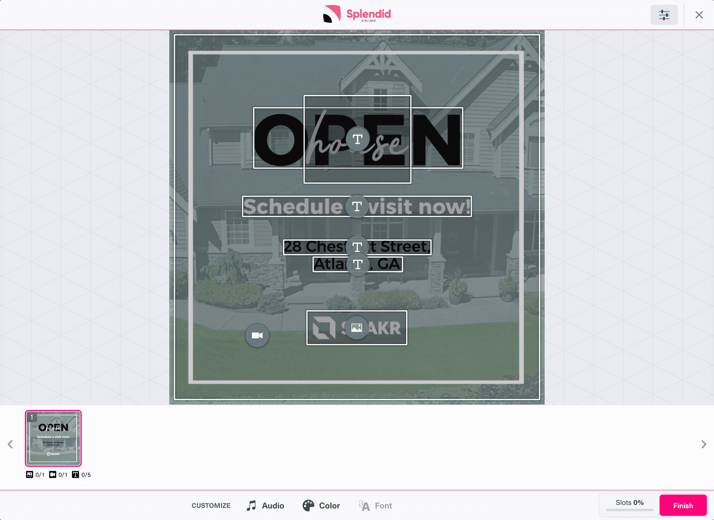
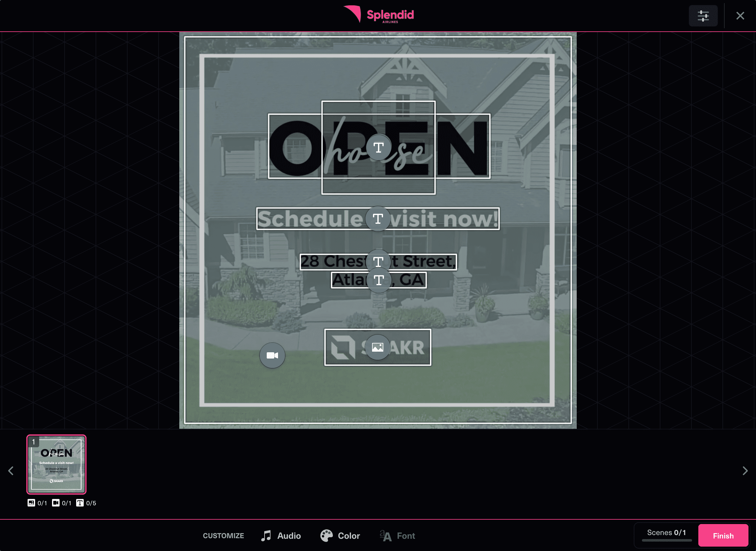
Video Editor SDK
- Light
- Dark
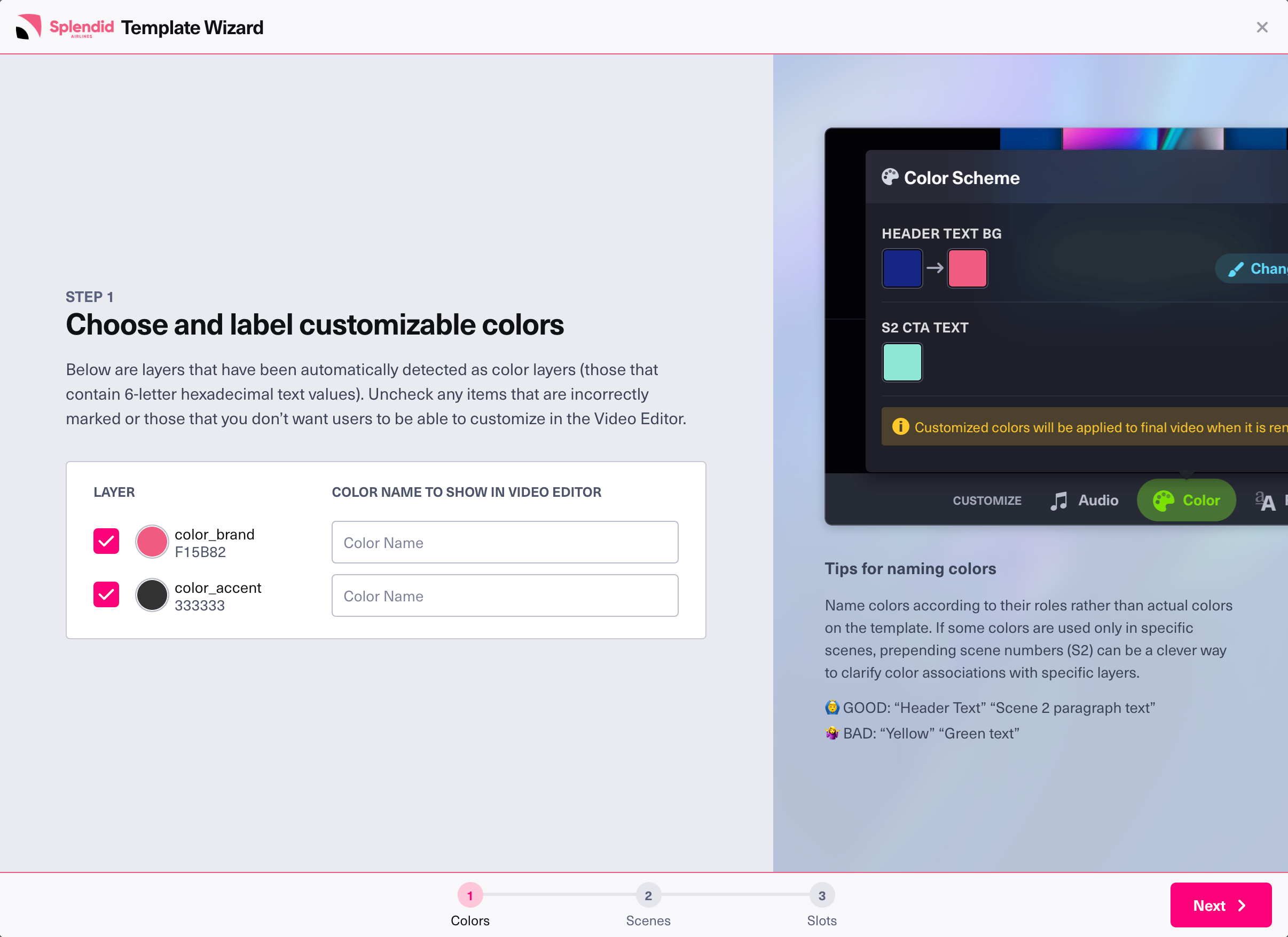
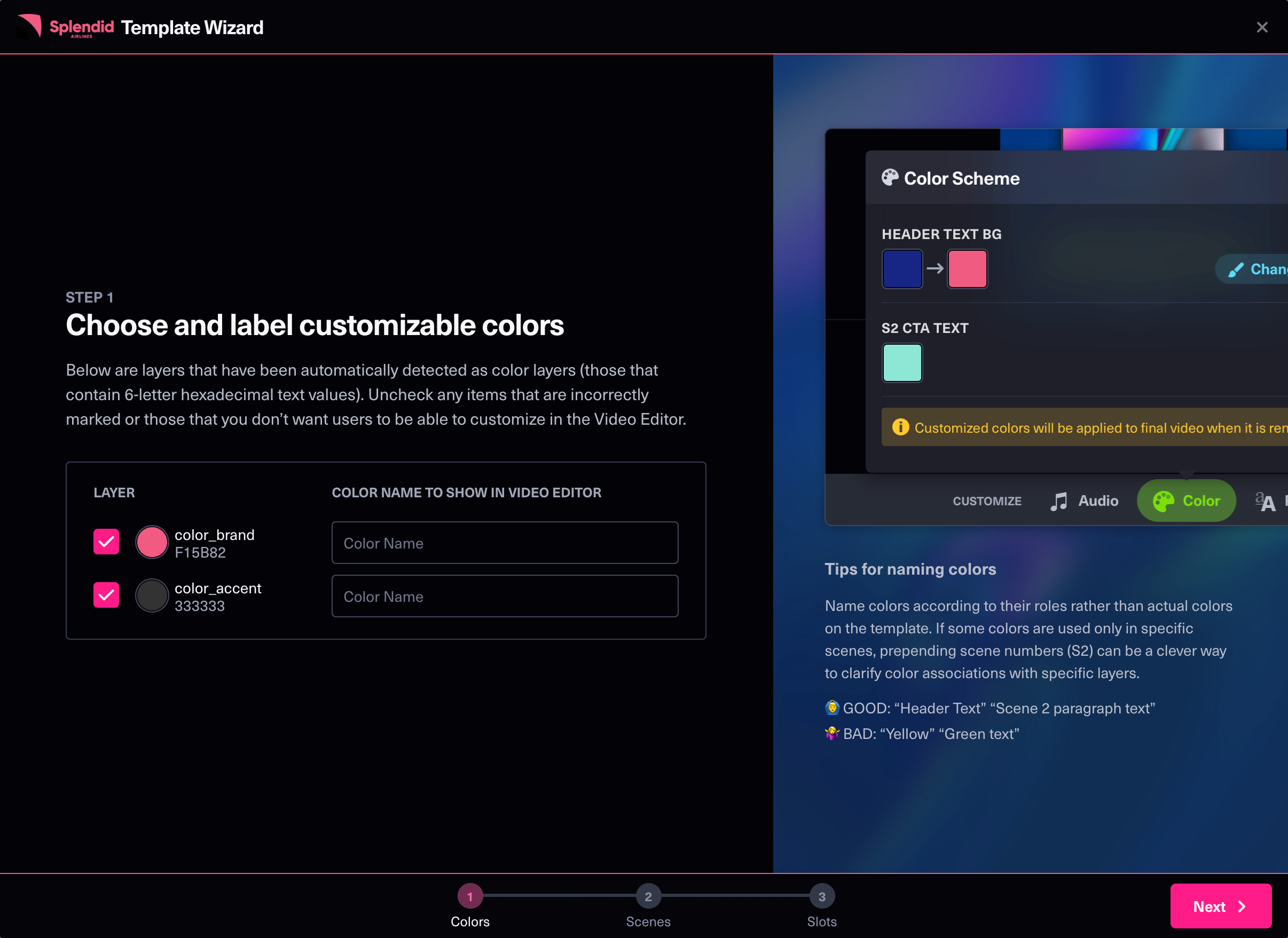
Template Editor SDK
- Light
- Dark
Customization Options
Custom logo
You can specify a custom logo image to show in the header bar by using the theme.logo option. The image will be scaled to fit in accordingly but for best visibility, use logo images in horizontal format (preferably within 6:1 aspect ratio.)
As for which image format to use, we recommend using an SVG file for the best quality when scaled, but you can also use a raster formats like PNG or JPEG.
Light mode and dark mode
You can use the theme.appearance option to set the editor's appearance to either light mode or dark mode. If you don't set this option, the editor will display in dark theme by default. If you would like the editor to match your browser's appearance, set the option to "browser".
info
For best results, do consider how the custom logo would look on top light or dark background depending on the appearance setting. For example, if you logo image has a bright text, it may be hard to read in combination with a light mode theme. When using the "browser" appearance option, you can use the theme.light_override.logo/theme.dark_override.logo options to specify light/dark variant images for both themes.
Accent colors
You can use the theme.accent_color option to customize the accent color in the editor, which is used many places like border color for current selected scene thumbnail, progress bar, finish button, etc. The accent color accepts color values in HEX code format, without the # prefix.
Button styles
You can use the following options to customize confirm/cancel button styles.
theme.button_border_radiustheme.cancel_button_border_widththeme.confirm_button_border_width
Header and footer styles
You can use the following options to customize header/footer background and border colors. (Header and footer cannot be styled separately.)
theme.header_footer_background_colortheme.header_footer_border_color
Override customized colors in light/dark appearance
By default, Editor SDK automatically adjusts colors to ensure text is readable on both light and dark modes. Sometimes, you might not like the automatically adjusted colors. For those cases, we provide the theme.dark_override and theme.light_override options for you to explicitly define colors for light and dark appearances respectively.
theme.light_override.logo/theme.dark_override.logotheme.light_override.accent_color/theme.dark_override.accent_colortheme.light_override.header_footer_background_color/theme.dark_override.header_footer_background_colortheme.light_override.header_footer_border_color/theme.dark_override.header_footer_border_color
Sample code
- Video Editor SDK
- Template Editor SDK
const editor = await createShakrEditor({
  ...,
  theme: {
    logo: "CUSTOM_LOGO_URL", // Optional
    appearance: "light", // Optional, Default: "dark", Accepts: "dark", "light", "browser"
    accent_color: "FF007B" // Optional
    button_border_radius: 5, // Optional, Default: 100
    cancel_button_border_width: 1, // Optional, Default: 0
    dark_override: {
      header_footer_background_color: '040408',
      header_footer_border_color: 'F15B82',
    },
    light_override: {
      header_footer_background_color: 'F8F8FB',
      header_footer_border_color: 'F15B82'
    }
  }
});
const editor = await createShakrreadyEditor({
  ...,
  theme: {
    logo: "CUSTOM_LOGO_URL", // Optional
    appearance: "light", // Optional, Default: "dark", Accepts: "dark", "light", "browser"
    accent_color: "FF007B" // Optional
    button_border_radius: 5, // Optional, Default: 100
    cancel_button_border_width: 1, // Optional, Default: 0
    dark_override: {
      header_footer_background_color: '040408',
      header_footer_border_color: 'F15B82',
    },
    light_override: {
      header_footer_background_color: 'F8F8FB',
      header_footer_border_color: 'F15B82'
    }
  }
});
Please refer to Reference section for more information about all available theme options.